(A master class for an advanced painter, and all others who want to become one.
Required: cup of coffee, patience and concentration)
During the last few years, a number of people asked me to write about my oil painting technique. Some of them told me that, while looking at my originals and trying to understand how I did it, they were not able to follow it after a certain point. They were puzzled by the unexpected and “unreadable” twists and turns in the application of the paint. Well, nothing wrong or strange about that, for I get lost in my own technique as well, after some time has passed since the completion of the painting. I would like to stress that there is no mystery about it whatsoever. The main reason for this little confusion can be found in the complexity and the unpredictability of my way of working.
Today I will try to reveal to you one of these techniques that I use on a regular basis. It is a little “trick” that, when performed in the proper way, can greatly enrich the painting and possibly make the spectator feel that he cannot follow it anymore. Which is a pleasing thing, I have to admit.
During the preparations for this post, and while painting, I have tried to concentrate my attention on how I actually do this technique, in order to be able to explain it to you. Perhaps it sounds a bit strange, but most of the time I do all these things automatically and intuitively, and almost never rationalize it, or try to explain to myself what I do. While painting I constantly react on what I see in front of me, on the canvas or board, instead of following a more or less detailed schedule of my future actions (this approach has, both, good and bad sides). By doing so, I often follow my intuition and the “voice” that tells me what paint I should use, how to apply it and where.
By the way, this reminds me of an interview with a world famous and old pianist, that I have heard some time ago. He said that, when one has reached a certain level of mastery, in order to develop himself further, one must start teaching. In order to teach properly, one has to first understand what, how and why one does what he does. I find this to be a great truth and a welcome revelation.
However, back to that specific little technique. After having defined the basic palette, and after having mixed the chosen colors on the palette, and after the underpainting is dry, I start applying the paint to the painting surface in a well concentrated and well guided, as well as spontaneous manner. At that point my every-brushstroke-counts “software” is switched on, and is not switched off until the painting is finished. From the very beginning I just try to put the right color on the right place, hoping that I will not have to adjust the color later on. But this is not an easy procedure and I often make mistakes and therefore have to search for the right solution later on by mixing the paint directly on the canvas. This is something that the art students and young inexperienced artists should avoid doing. It is advisable to learn to mix the paint on the palette, for this is the basis of painting and has to be mastered first.
In spite of my experience as a painter, I often find myself on the edge of muddying the paint while mixing it on the painting surface. Therefore I have to be extremely concentrated and know, more or less exactly, how a particular combination of colors would behave when mixed directly on the canvas. In order to avoid the problem of muddying the colors, I developed a technique that enables me to achieve my goals, though often not without a struggle.
Here is how I perform this technique. For instance, if I want to paint a red object, and I have already applied a certain red color to that particular spot on the painting, and the applied color is not optimal in the terms of value or intensity, I apply then, another color on top of it. It is essential to do it wet-on-wet as to allow the paints to mix nicely with each other. Besides, guided by the every-brushstroke-counts idea, the first layer of color is already applied in an expressive manner, creating a nice and lively brushwork, that I would like to preserve and therefore don’t want to cover it completely. Depending on the effect I want to achieve, I might use a mixture of greens, preferably not mixed too much. The traces of the pure colors that make up the mixture should be visible here and there (for example Viridian green + Yellowish green + a pinch of King’s blue, the traces of all colors separately visible in the mixture). There comes a crucial moment - we know that red and green are complementary colors, which means that they stand out nicely when placed next to each other. On the other hand, when unskillfully mixed they often produce a kind of dull, grayish, even muddy variation of one of these colors, depending on their proportion within the mixture. In order to avoid taking out the vibrancy and the freshness of the already applied red color, I mix the greenish color with enough medium to give it the desirable fluidity, and then apply it on the top of the underlying wet red paint. Naturally these two colors will mix and create a new one, hopefully the one that I had on my mind.
To achieve the most optimal results I found out that the following procedure works the best for me: In order not to muddy the colors, and at the same time not to cover the interesting underlying brushwork entirely, I apply the greenish color in one or two brushstrokes to the red spot in question. The less brushstrokes, the more of the vibrancy and the freshness is preserved. (I still dream of a perfect realistic painting that would consist only of one brushstroke color applications. I am afraid I will have to keep on dreaming because this goal is almost unattainable. It would have to be created with the mind and by the hand of a Taoist Chinese calligrapher, which I am not.)
However, the size of the brush is also important. I usually make sure that the brush is, either a little smaller than the area that I intend to apply the new layer of paint to, or about twice smaller than that area. Other options are also possible, but for me this works the best. This forces me to use not more than two brushstrokes. Needless to say, the second layer of paint has to be of the right color and value, otherwise I would have to repeat the procedure. By repeating the procedure more paint is applied to the same surface and a new situation is being created that asks for a slight adjustment in the approach. The more often I repeat this procedure, the further away I go from the most optimal results. Sometimes I bring too much paint onto the surface, which makes the paint unworkable. The only solution left ( apart from ‘ the kitchen paper towel maneuver’ – see my post from December 2010 for further information, please) is to scratch off the paint and start all over again, which is very frustrating for me, and therefore I try to be as precise as possible in applying the right color, to the right place, and in the right manner.
 |
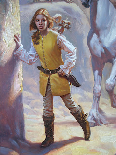
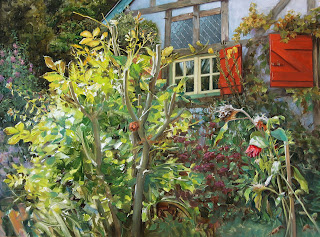
The following close-ups from a few recent paintings show the various results of this technique. |


There is another aspect that has to be taken care of, as far as this way of working is concerned. It is the pressure I impose on the brush while applying the second layer of paint onto the wet underlying layer. You don’t want to squeeze out the underlying wet layer, while bringing on the next one. Unfortunately I am not able to explain this to you by words. It is something that has to do with the feeling one has to develop through the years of work and practice. Also, the pressure that is imposed on the brush often reflects the sensitivity and the character of the artist’s personality, and it defines the unique quality of the art, it gives it its unique pulse and character. These things cannot and should not be suppressed. They have to be given the chance to develop freely through hard work. In other words, through much practice one will not only be able to feel how hard one has to press the brush, while pushing it around over the canvas, but also he will be able to connect to the “spirit” of the paint. Although this sounds like a New Age quasi spiritual thing, it is not. It is a very important point, because the paint itself is something which defines how far you can go and what you can “squeeze out” of it, on the way of achieving your goals. One has to feel and know the nature of the paint. One has to tame it.
You may ask: Petar, why does it have to be so complicated? Well, as far as my technique is concerned, there are 3 + 1 aspects that make it complex. These aspects must be taken in consideration, in order to create the effect of vibrancy, light, freshness and life in a painting.
1- The dry monochromatic (in my case reddish – ochre) underpainting has to show through the next few layers.
2- The first wet layer, that in fact defines the biggest portion of the painted object, has to be in place, vibrant and sufficiently visible.
3- The top layer, that is partly mixed with the first one, has to be of the right value, fluidity and color.
The + 1 aspect is ´the direction of the brushstroke´. This is an aspect that is also important and that I will be covering in a future post.
The key secret of this technique is hidden in both the optical mixing of the applied colors, as well as in the transparency of the applied layers. If done properly it gives to the painting a translucent and vibrant feel, and often forces people to comment: “ It is as if the painting itself emanates light”. These qualities strengthen the feeling of the painting being full of Life and movement. Personally, I enjoy the most when people describe the way they experience my paintings in these particular terms. What more can you expect as a realist painter, than to hear that your paintings, in other words your two dimensional representations of the scenes from real or imagined Life, are full of Life!
Because it is of essential importance, I will say it once again – one has to learn to mix the paint on the palette first. Only then you will be properly equipped for performing this wet-on-wet technique correctly, without muddying the colors and by doing so, killing the light and life in the painting. One must not use the technique of mixing the paint on the canvas as a substitute for his inability to find the right color by mixing the paint on his palette.
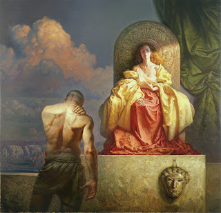 |
The Dawn of the Day, oil on Masonite, 93x90 cm (36 1/2”x35 1/2”), 2002. At the time I did this painting, I was not yet able to perform this technique properly, hence the feeling of relative stiffness in the painting. |
In the end, I am quite sure that many skillful painters use the same kind of technique, consciously or unconsciously, and with necessary differences and variations in the approach and performance. This is nothing new, it is only my own variation of this well-known oil paint technique. The things I just said have to be understood as general guidelines for artists who intend to try their hand at it.
I hope that this explanation makes sense. I have tried to be as short and as clear as possible. If you feel a bit dizzy, or have got a bit of a headache, take a sip of coffee, that I suggested to have beside you at the beginning of this long essay on a tiny but important aspect of my painting technique.
After writing so much text in English (do not forget that I am not a native speaker), I am certainly in need of a cup of strong coffee myself!
Have a good day!